


The Amazon rainforest is more than just a biological powerhouse; it is a vast, fragmented territory that has long struggled to present a unified identity. To solve this, a massive new tourism initiative has launched a brand identity that is as much a part of the landscape as the trees themselves.
By utilizing the literal geometry of the river system, the new Amazonia brand aims to unify nine Brazilian states, hundreds of cities, and millions of people under a single, recognizable banner.
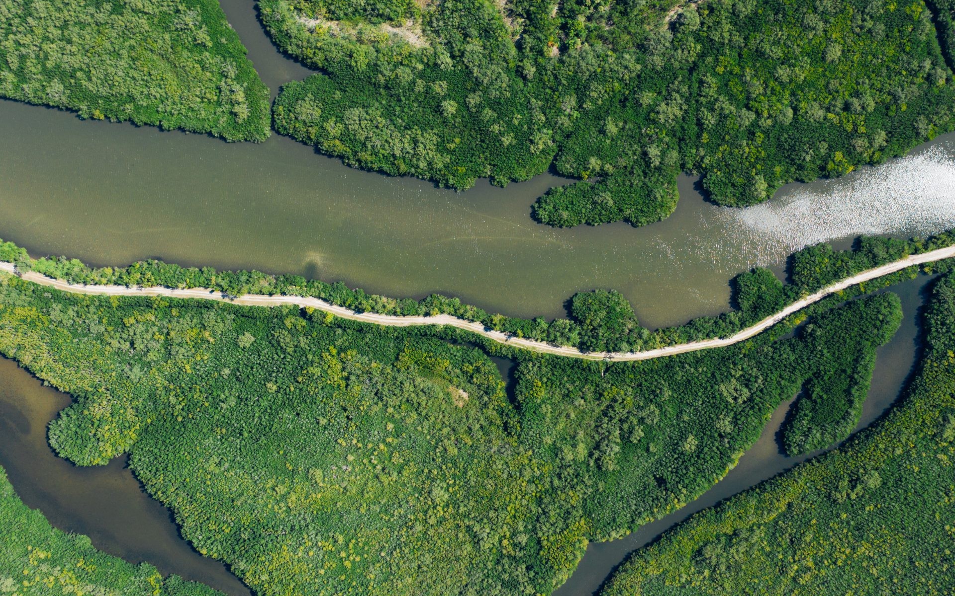
A Brand Carved by Water
In a striking departure from traditional graphic design, the cornerstone of the Amazonia identity is its custom typeface: Igaratype.
The name is derived from igarapé, the Portuguese word for a small stream. Rather than being drawn by hand in a studio, the letters were “discovered” using satellite imagery and geographic coordinates. Designers mapped the natural bends, twists, and tributaries of the Amazon River system to form the characters of the alphabet.
This approach creates a direct, physical link between the brand and the geography it represents. Much like NASA’s Landsat tools allow users to interact with Earth’s features, Igaratype allows users to “write” with the actual currents of the Amazon.
Why Unification Matters
The “Legal Amazon” is a territory of staggering proportions—larger than the entire country of India and covering 60% of Brazil. Despite this scale, the region has historically suffered from fragmented communication.
As Ana Jacques, project manager at the Brazilian Tourism Board (Embratur), noted, the region’s nine states have often communicated with the rest of Brazil as isolated entities rather than a cohesive destination. This fragmentation makes it difficult to market the region’s collective strengths to the world.
The Amazonia initiative, led by Integrated Amazon Routes (RAI) and FutureBrand São Paulo, seeks to bridge these gaps by:
– Consolidating diverse experiences: Bringing together everything from the high peaks of Amazonas to the acai production of Pará.
– Promoting sustainable development: Creating a unified framework that supports local businesses and communities.
– Establishing a “Seal of Origin”: The Feito de Amazônia (“Made of Amazon”) seal will act as a certification for local products, crafts, and music, helping artisans and small businesses gain international visibility and higher revenue.
Celebrating Cultural Diversity
While the river system provides a physical thread that connects the region, the Amazon is not a monolith. Each of the nine states—including Amazonas, Amapá, Pará, Rondônia, Mato Grosso, Acre, Maranhão, Roraima, and Tocantins—possesses its own unique cultural and ecological character.
To avoid a “one-size-fits-all” aesthetic, the visual identity was shaped by a collective of local creators. The project collaborated with various illustrators, photographers, and letterers from across the nine states to ensure the brand reflected the immeasurable wealth of the region rather than a single perspective.
“We don’t have just one, but many Amazons,” remarked illustrator Winy Tapajós, highlighting the complexity of representing such a vast territory.
Looking Ahead
The launch of Amazonia is an ambitious attempt to turn a geographical reality into a global brand. By combining high-tech satellite mapping with local artistry, the initiative hopes to transform the way the world perceives the Amazon—moving from a distant, monolithic forest to a vibrant, interconnected destination of endless discovery.
Conclusion: By using the river’s own geometry to define its visual identity, the Amazonia project seeks to unify a fragmented region and empower its local communities through a globally recognized, sustainable brand.


